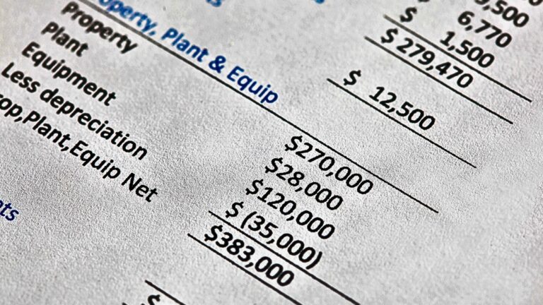
I’m assuming that the only content writers who present income statements as bar charts are non-financial people. Am I right?
In this short article, I will show you a couple of examples and explain why they add no value in the analytical process. But I will still show you my options that provide context, trending, and even predictability, thanks to a person named Shewhart.
G3VIP
To read this article, you need to log in as a G3VIP.