I was recently watching a video on churn analytics by the great people at Peel Insights. However, I wasn’t expecting new ideas on churn because 99% of all experts are great at providing a measurement for churn either by day, week, or month, depending on your rollup needs.
As I expected, they left out the most important descriptive piece of data for their visual churn analysis. Can you spot it below?
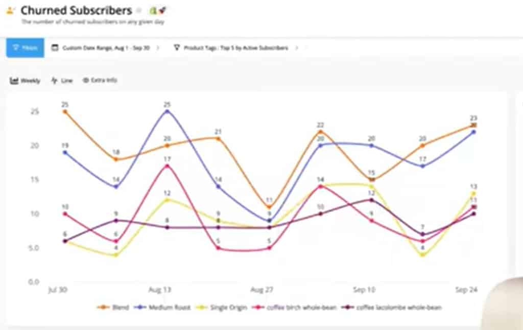
Technically, there is nothing wrong with this chart. I’m sure the data is accurate along with the time periods in which the churn occurred. What I find surprising is what’s missing and what’s excluded for a Peel user to filter in this simple run chart.
Incidentally, I’m not picking on Peel. They are showing what most other software vendors show on churn graphs. Possibly because it’s a) easy, and/or b) that’s all they understand regarding churn.
In this brief discussion, I’ll explain two other critical pieces of information we have to know when looking at our churn data so that we can start taking corrective action where we can better control the desired outcomes.
G3VIP
To read this article, you need to log in as a G3VIP.