Periodically, I get a call or email from a client early in the month stating something like, “Hey Mark, we had an awesome month. What do you think?”
CEOs love sales. Heck, CFOs probably love sales even more. But I still hate these messages unless I know the plan calls for increases on the top line.
I used to ask, “Why the increase?” The typical response was, “Well, I’m not sure. We just had a good month.” When I get that feedback, then I can rest assured that the sales increase is merely random.
So I quit asking.
No, I’m not trying to rain on anyone’s party. But stay with me–you need to be able to answer the “why” behind your sales increase. There might be a compelling story, maybe not.
My Restaurant Sales Were Up 7.1 Percent Last Month
Let’s start at the top. See if this discussion resonates between a restaurant owner and his CFO.
CFO: Was the sales increase planned?
CEO: What’s a plan? We don’t do that around here.
CFO: Okay. Then what drove the sales increase?
CEO: What do you mean? I just watch the dollars. We were up more than 7%. What’s wrong with that? I think my store is looking up.
CFO: Well, maybe. Have you looked at your covers (transactions) month by month? How about average ticket?
CEO: Hey, you ask a lot of questions. I need my accountant to look into that.
Thankfully, the CEOs I serve are not this simple minded. If so, then God help me.
But the above dialogue is a good springboard as to how we should look at our top-line sales.
You Don’t Need to Be a Brain Surgeon to Understand the Math
I’ve always wondered what occupation a brain surgeon uses when explaining a complicated concept. Rocket scientist?
Sorry, I digress.
Let’s start with the most fundamental sales analysis I can think of–I use it for all of my clients. Don’t worry, the math is easy.
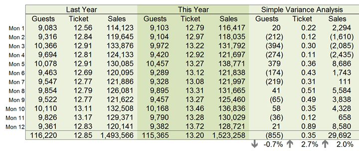
Below is a simple sales variance analysis where we isolate on transactions, average ticket, and sales (while the numbers are small for this one-store restaurant operation, the concept applies to any transaction-based company).
Remember, our CEO has stated sales are up more than 7% in the prior month ($128,721 vs. $120,141). You will find those numbers right above the totals.
But what do you notice? Here are my overall observations at a high level:
- That prior month increase appears random (more on this later)
- For the last 12 months, sales are only up about $30,000
- But not because of transactions–those are down 855
- We’re up because the average ticket increased from $12.85 to $13.20
What do you think so far? Is this much better? Does this provide deeper insight to our top line?
I’m not done. I’m just getting started.
Every Small Business Should Be Analyzing Sales Using Simple Unit-Rate Variance Analysis
In the snapshot above, I’m referring to that table as a simple variance analysis. The emphasis is on simple.
I’m too lazy to pull out my old cost accounting textbook, but I think we call the table below a unit-rate variance analysis.
My friend Rand Heer of Alight Planning calls the snapshot causal analysis. He’s a smart dude, but the average Joe doesn’t recognize that term. So I’m sticking to unit-rate variance analysis as shown below:
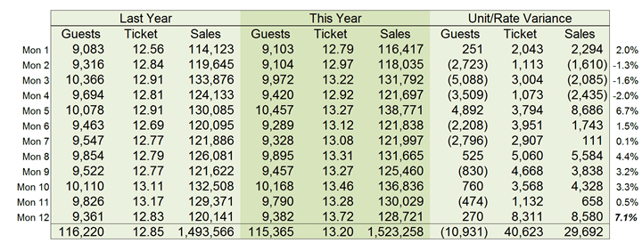
The second snapshot is similar, yet different from the first. The primary difference is reflected in the Unit/Rate Variance columns. For convenience, I’ve added the monthly percentage sales increase at the far right.
So let’s see what we can glean from this table:
- Sales are down overall by nearly $30,000 (see bottom, far right, last row)
- The dollar impact of guest transactions being down by 855 is $10,931
- The dollar impact of the average ticket increasing to $13.20 is $40,623
Now we have a better understanding of why sales are up overall the past year. It’s not the number of transactions which are down.
We can clearly see that the average ticket increase is driving sales upward. We saw that in the simple variance analysis. But in this table, we know the actual sales impact by dollars. And that’s important.
The beauty of the unit-rate variance analysis is that we can measure the dollar impact of transactions and average ticket sizes being either up or down.
More importantly, we now have insight as to what we need to work on–getting more butts in seats. Without this insight, the owner might be content with an overall store increase of 2%.
On Deck, Trend Analysis
I’m just warming up.
Remember, our CEO said, “I think my store is looking up.” The CEO said this in light of a good month.
Not so fast. Let’s look at the last 24 months of sales and see what we can learn.
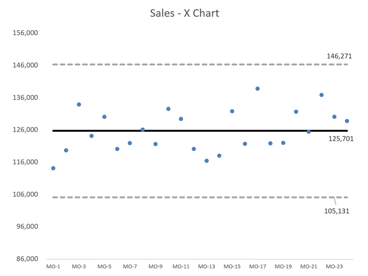
I’ve included 4 pieces of data.
The small dots represent actual sales by month. The solid line in the middle is the average over the past 24 months.
The dotted lines are approximately 3 sigma above and below the central line–we call these upper and lower limits.
Here’s the main thing you need to know about these charts–most data fall within the upper and lower limits unless there’s been a significant change in a process or behavior that would impact these limits.
Accordingly, any changes from month to month are merely random from a statistical point of view. So that 7.1% increase the prior month is just noise in a sea of other data points.
Transactions (Guest) X Chart
Let’s see what the chart looks like for number of transactions.
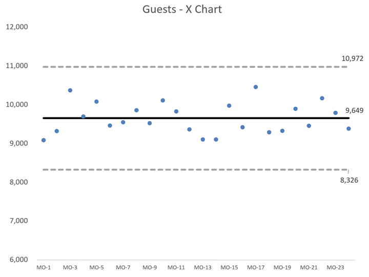
My primary observation is that there’s minimal variation with our transactions. But we need to keep an eye on the data as we did see a one-year drop of 855 transactions which negatively impacted sales by nearly $11,000.
Many small business owners focus on the dollars only. Do that and you are shooting yourself in the foot. Customer and transaction churn is a deadly cancer in any business that desires to stay alive in the long term.
Are you monitoring your customer/client sales transactions similarly to what we’ve covered so far?
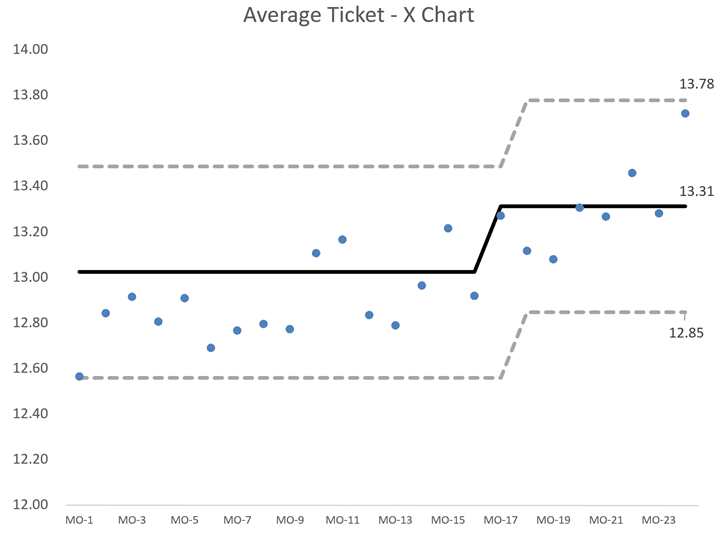
Average Ticket X Chart
Finally, let’s look at the trend for the average ticket size. My Excel template automatically repainted the average line as the prior eight periods were above the original calculated average–that run (or streak) triggered the increase in the average and the upper and lower limits.
The underlying causes pushing data upward in this case do not happen by accident.
About a year ago, I found out the owner finally increased menu prices across the board due to increases in commodities like dairy products, poultry, seafood, and a few other categories.
The owner conducted training on upsales with its dining crew. It’s no wonder the central tendency and the limits moved northward.
What about the $13.78 in the previous month? It’s within the upper and lower limits. Still, it’s getting close to an outlier.
In my discussion with the owner, there were some specials on the menu on a one-time basis at higher pricing. Unfortunately, the promotion had no impact on getting butts in seats. And the one-time large increase will not be recurring.
“I think my store is looking up,” said our CEO earlier. Based on what you have learned, what would you say to her?
The Purpose of Data
Data can be so darned insensitive at times. It should. Data has no personality.
But you do. And you have full control to behave in ways that will shape this data to your liking. The data merely tells whether your behaviors and actions are working or not.
Remember the famous line in Glengarry Glen Ross? “Always be closing.”
Similarly, you should always be innovating. Always be getting butts in seats. Always doing what it takes to make sales increases recurring.
And that’s why it’s critical not to just look at top-line sales in isolation or even a month’s worth of data compared to a prior period.
I leave you with a $64,000 question. The next time you have a great sales month, what will you say to your CFO?