I’m a ravenous fan of any framework that is based on the concepts of better, faster, easier, methodical, and so on. Lean Six Sigma easily fits the bill.
First things first:
1. I’m not an expert in Lean Six Sigma.
2. I don’t even implement such systems or frameworks.
3. But I do try to live by the underlying principles of Lean Six Sigma personally and professionally every single day.
I have my own simple framework I use for Lean Six Sigma, and the framework starts with 4 words–2 for Lean, and 2 for Six Sigma. I did not invent these four words. I’ve probably read them hundreds of times over the years from different practitioners. So attribution goes to every amazing Lean Six Sigma expert and teacher on the planet.
Now then, those four words:
Lean – waste elimination
Six Sigma – minimal deviation
A Visual Explanation to Lean Principles
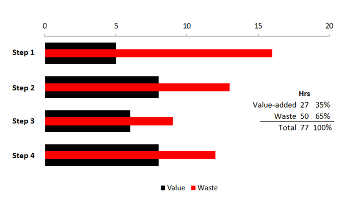
If I tried to explain Lean Principles (yes, I will always capitalize these two words), I’d start with a graph. It’s somewhat exaggerated, but it helps to reveal a key point about waste elimination.
Assume we have a process requiring four distinct steps. Each step has sequences requiring so many hours to complete. The graph below shows hours consumed for value-added activities along with waste.
I purposely kept the graph simple. The four steps show the hours required that add value to the customer (internal or external). The red bar represents waste that has already been measured.
Notice the first step requires 20 hours. Twelve of those hours are waste.
So here is the question. Do you improve the overall process by chiseling down the black bars representing value-added activities? Or do you work first on eliminating waste?
The answer seems obvious, but experience has revealed we are tempted to work on improving the value-added activities while taking waste completely for granted.
Look What Happens When We Start Eliminating Waste
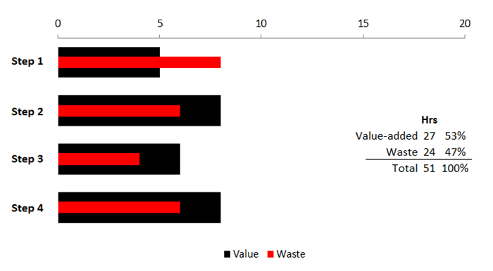
Assume we start cutting our waste in about half the hours we started with. Here are the results visually:
By reducing 26 hours of waste in our value stream, we improve our overall throughput by 34%.
By now, you may recognize the term “continuous improvement” takes on a whole new meaning. In the visual presentation above, perhaps we should view continuous improvement as the relentless, never-ending pursuit of waste elimination in addition to throughput increases in our value-added activities. In short, continuous improvement is synonymous with tightly ingrained Lean Principles.
What About Cost Reduction?
As I stated earlier, I’m not the lean guy. Since I generally work with growth companies, throughput is my number one priority.
While cost could be added as another dimension in the graphs above, it generally remains a secondary priority in my mindset. And that may sound sinful coming from a CFO.
If I’m working with a small, service-based business with 10 employees generating $2.5 million, costs will not necessarily decrease in waste-elimination efforts as all labor is (normally) fixed. Eliminating waste instead means we get more done, we generate more revenue, and we have happier customers. If costs drop as a result of reducing waste, I consider that a strategic byproduct.
I’m not against reducing cost. It’s just secondary for the client base I tend to work with.
In a retail or small manufacturing environment, cost reduction may be the priority. Besides, what is excess inventory? Waste. And excess inventory is costly.
To wrap up, consider the simple Lean Principle process as:
1. Focusing on waste reduction/elimination first, then
2. Looking for ways to improve or enhancing the value-added activities, and finally,
3. Exploring ways to reduce costs for all value-added activities.
Like any framework, the process does not have to be followed exactly. For example, my number 3 above could be your number 1. Regardless, the three activities above will generally occur in any Lean Principle framework.
What About Value Mapping?
Will you mind if I say I’m not the lean expert guy? I’m not.
But value-stream mapping is important. But I hardly doubt if I do it the way the pros do it.
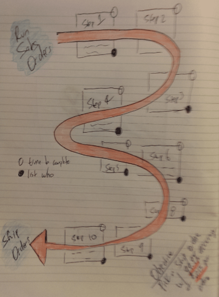
In the ’90s, I used Visio. Today, I occasionally use SmartDraw. My preference today? A Moleskin notebook, and a few colored pencils:
My simple maps sometimes look like a racetrack with squares representing steps. Or they could look like an ‘S’ or inverted ‘S’.
In every case, I want a starting point and an ending point. Every box representing a step includes a small notation for person or role and time to complete. You’ll need that information later as you clean up your first map in the software editor of your choice.
Ultimately, my goal is to generate a grid similar to the one below:
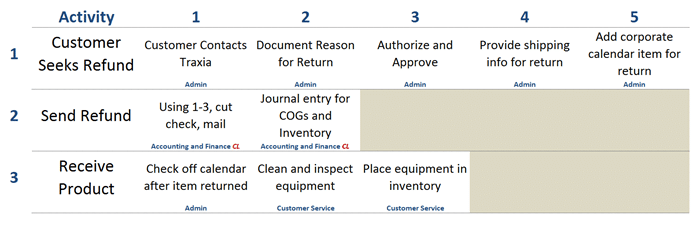
Personally, I like to see my activities listed vertically, and each step for each major activity in the value stream listed horizontally. My rule of thumb is no more than 5 steps per activity with 3 being my preference. More steps generally mean more waste and a greater likelihood of making mistakes.
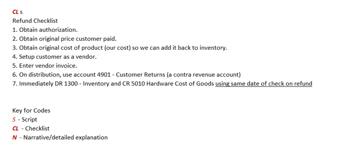
Ideally, each box will list the individual, the time required, and a notation such as S, CL, or N. The ‘S’ is for scripts that would be documented elsewhere. The ‘CL’ is for checklist, and the ‘N’ stands for narrative or detailed explanation.
I’ve included a checklist below for the same value-stream grid shown earlier. The checklist below is before any waste-trimming activities have been applied.
A Couple Other Suggestions for Your Value-Stream Documentation
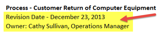
Should you document your value stream using a grid similar to the above or by only using flowcharts, do not forget to include a revision date and the owner.
I would even go the extra mile by maintaining a small accessible database listing all of your value-stream maps. I suggest that every map be revisited every 3 months or less. I’m 100% confident your processes will be continually refined as your team members work with a Lean Principles mindset. So don’t be surprised if the value stream maps are updated far more frequently.
Secondly, give your value stream a name. This one piece of advise may be worth the price of admission.
Every business has its secret sauce or X factor. If that’s true, why not name your most important processes?
By naming your processes, you accomplish the following:
1. Company-wide communication is greatly enhanced.
2. Explaining key concepts as they relate to key processes is simplified.
3. While personal opinion only, I believe a ‘fun’ factor is enhanced when every single core process in the business has a unique X factor name.
Just do it–name your X factor core processes.
Moving On to Six Sigma
It’s time for the qualifying comment once again. I’m not the expert. I just embrace the concepts. Nor is this meant to be a Wikipedia-like discussion on an important management paradigm.
Instead, I just want to share one simple tool I use regularly as it applies to Six Sigma.
Before we move on, remember the two words I used earlier to explain Six Sigma–minimal deviation.
Six Sigma Analysis in a QSR Environment
My favorite place to buy a deli sandwich is Planet Sub based in Kansas City, Missouri. I even go out of my way to visit their Zona Rosa store when I’m around the area. And I also like their downtown location in Kansas City.
Like many growing quick serve restaurants (QSRs), opening a new store is time consuming, requires a great deal of coordination from all team members, and is very stressful from start to finish.
Many QSRs have their store-opening processes nailed down with detailed checklists. Let’s pick on Planet Sub and assume they are continually perfecting their process by eliminating waste. How do they track the progress?
While overly simplistic, here’s a simple statistical process chart that reveals the number of hours taken to open a store from start to finish. I purposely kept this simple as we would typically have separate charts for site location, lease negotiations, re-model, training, and grand opening activities.
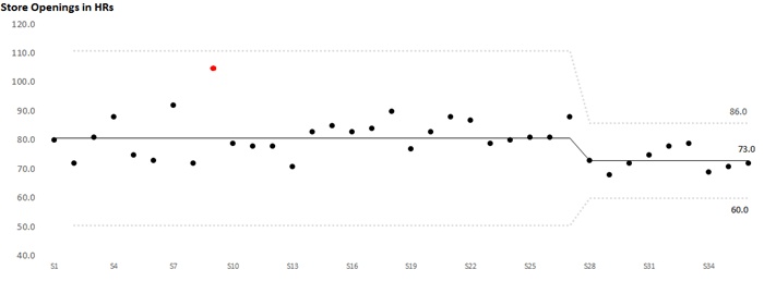
There are 3 important pieces of information in this chart.
1. The central line is the solid line in the middle. Notice the average dropped at Store Number 28. The average hours to open the stores is now 73 hours in this made-up example. Before Store Number 28, the average time to open a store was 81 hours. There’s only one way to drop the average hours, and the answer is not by accident.
Instead, a major change in the process has to have happened for the average to drop.
2. The next important piece of information is the upper and lower limits. The upper and lower limits are 3 sigma from the central (average) line. In short, we want minimal variation. Before the shift and drop to 73 average hours to open a store, the range was 111 hours for the upper limit. The lower limit was 51 hours.
That’s way too much variation. In brief, every data point inside the limits is purely a random event. All the observations we are plotting that are within the limits are nothing more than noise. Before Store Number 28, a store opening of 60 hours would have been nice and led to celebration. But scientifically, it would have only been a random event, nothing more.
So why did the central line and upper and lower limits move downward? In this specific case, we had a run of 8 stores in a row that were below the central (average) line. The cause in the drop is assignable to the elimination of waste reduction in the store-opening process (they started implementing Lean Principles in this fictitious example).
3. The other key piece of information–the observations. Each observation in the example above is a small dot. When I look at these charts, I’m obviously looking for patterns. Be careful about plotting too much on one chart. As mentioned previously, it’s best to track the observations by individual process versus the whole. There’s nothing wrong with the example above. We just need to know what’s driving those hours by type of process.
Master the Six Sigma Concepts First, the Tracking Techniques Later
The objective here is not to teach you how to build these charts. That’s what Wikipedia is for or the many professionals that do this for a full-time living.
Instead, understand that Six Sigma is about minimizing variation. Want to change the average or central line in a critical process? Change or improve the process.
Want to significantly reduce the variation that occurs in your key processes? Again, change or improve the process.
And just how do we do that? We come full circle by going back to our Lean Principles.
Start with reducing waste. Continue by improving the process. Then, your Six Sigma mindset and activities will force you to ensure all core processes are being applied consistently at all times.
A Brief Postscript Having Nothing to Do with Lean Six Sigma
If you ever buy a great sandwich at Planet Sub, you never know who you’ll bump into.
Below is a snapshot from the Maplewood, Missouri store with three members of the Memphis Mafia–three young, home-grown St. Louis Cardinals that played a prominent role in the 2011 World Series during the prior week.
No, I didn’t take the snapshot (wish I had).