I’ve maintained my maintenance agreement with Tableau Software since the year or two after it debuted. But I’m no designer. Never have been. Never will.
I admire many of the great visual analytics that Tableau designers show off on their blogs (I’ve listed some of my favorite Tableau blogs at the end of this post). I just can’t replicate their talent. And forget the 10,000-hour rule. I’m a lost cause.
Remember Dan Pink’s encouragement from his book, A Whole New Mind? He recommends we learn how to draw so that we can learn to creatively think better. I just wonder if this will help me build better Tableau visuals. I’m not holding my breath.
In spite of my visual design shortcomings, a couple of years ago, I started toying with visually displaying revenue and billings pipelines.
2 Pipeline Definitions and the One I’m Using in this Discussion
For service-based businesses, there are actually 2 pipelines. The first pipeline is the one we typically think about when addressing this topic–non-converted leads falling somewhere in our sales pipeline (e.g., prospect seeking more information, pending estimate, waiting for prospect approval).
The second pipeline is the one I’m focusing on–future bookings or revenues under contract. This is revenue already in the hand that has not been earned yet or billed to our customers.
I care about both pipelines, but for the purposes of this discussion, I’m focusing on the second one.
Three Reasons I Need to See My Client Revenue/Billings Pipelines Visually
When I study the (second) pipeline for each of my clients, I’m not just looking for dollars to be earned in the future. Sure, this information is fed into a financial model to help us project cash flow and our LOC needs.
Instead, I’m also looking for signals and insights about our marketing and sales processes. Better lead management from prospect identification, to prospect qualification, to quoting, to closure should reveal consistency in our pipelines over a long period of time (the exceptions will be during market downturns).
This thought process has brought me to the reasons I want to see this information visually:
1. If we were to quit selling today, how much in revenues or billings are we guaranteed over the next few months? In short, I want to know the length of the pipeline. Pipeline length helps me to plan short-term cash needs.
2. We’re all greedy, so I want to know the dollar amount we can expect which addresses the height of the pipeline. As the height decreases, so will my projected cash levels. More than likely, LOC increases will follow.
3. Finally, every pipeline levels off near the end. Accordingly, I care very much about the slope of the pipeline and just where it starts to level off. This gives me greater clarity in predicting short-term cash levels.
My Simple 3-Step Process to the Visual Display of Contract Revenues or Billings
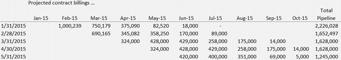
Step 1 is pretty obvious. In my case, I’m most interested in projected billings under contract. This part is super easy–do it in a spreadsheet. In the first column, list the most recent month ended. Then drop in the projected billings over the next handful of months as best as possible. Repeat this each time period.
How many months should I track? For visual analysis, I normally do 5 periods, and certainly no more than 6. I’m looking for trends. Five or 6 lines on the chart will be all we need to spot problems. Here’s what step 1 looks like:
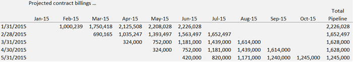
Step 2 is just a continuation of the first step. However, we need the cumulative dollars in the pipeline by month. The cumulative dollars represent the crème de la crème to make the visual pop with meaning. Leave this step out and we miss out on the pipeline length, height, and slope.
Step 3 is merely drawing the chart as follows:
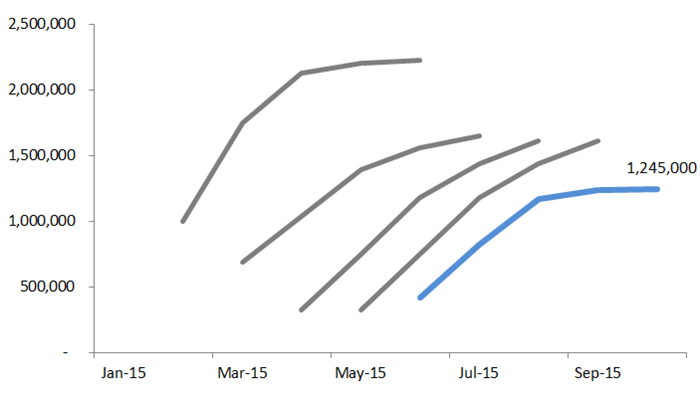
This visual reveals a couple ugly trends about our projected contract billings. First, the height keeps shrinking. Not good.
While the data table reveals this, the length of the pipeline in going to stick in my mind, as I can clearly see it generally spans 5 to 6 months.
Finally, I’m noticing the slope of each month’s projected pipeline generally starts to flatten around month 3 or 4.
My first action? See if the lead generation and management process has changed, and then identify what’s working or not working.
The purpose of all analysis is action. Preferably, immediate action.
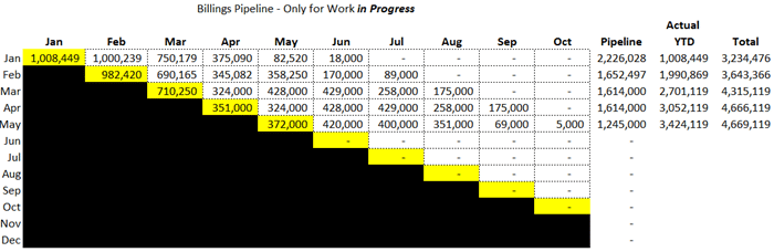
Don’t Drop the Data Tables
Below is how I track actual revenues and/or billings over time. The yellow cells below include actual results and are accumulated over in the totals section at the right.
Each month, I encourage clients to drop in their projected contract revenues or billings in the white area as shown above (in some instances, we have a separate table for both contract revenues and billings).
Bonus Material–Traditional Pipeline Dashboards
My focus above was showing how to visualize billings or revenues in pipeline number 2–the kind where the work is already under contract.
What about the traditional pipeline we’re used to seeing? From what I have seen (and you too, probably), CRM systems generally have great visuals for their pipeline reporting.
If you do not have a CRM (and you should if you serve B2B clients), look for basic reporting that includes the following:
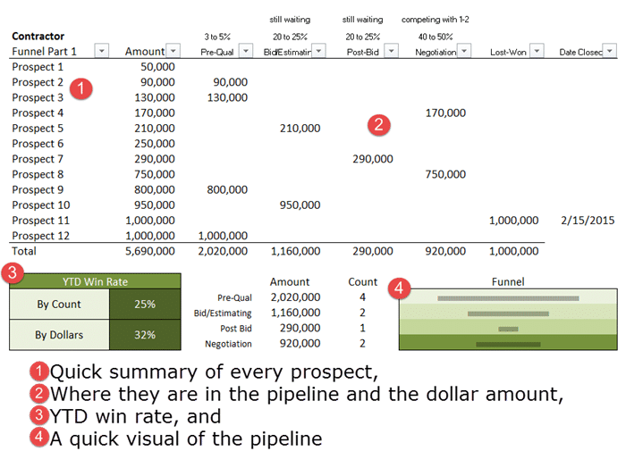
Reference and Further Reading–Tableau Blogs
As mentioned earlier, I stated there are several Tableau-related blogs read. Here’s my shortlist:
1. Data Revelations is probably my favorite.
2. VizPainter–I like his style of writing.
3. Drawing with Numbers–great title.
5. Freakaytics – I love everything Stephen McDaniel and his wife writes. This link goes to the Tableau category of his blog.
There are more, but the five above are my Tableau hot spots. Of course, there’s Tableau’s blog too.